Pale Blue Dot....
... but how blue?
I'm a fan of learning things through problems. Specifically, in this example, I wanted to shuffle off my dinosaur image with regards to programming, and learn more python, which is the language of choice of the younger generation (although why people think that an interpretative language is better than a "deeper" programming language, I don't know - grumble, grumble, grumble....).
Right, to the problem in hand. The Pale Blue Dot is our planet Earth, our home. We know that it is a Water-World, but luckily not the Waterworld, but a planet whose surface area is 70% water. We're plodding along on a minority of the planet.
So, I woke up on Sunday and thought - "What is the view of the Earth that shows the maximum amount of ocean?" and conversely "What is the view of the Earth that shows the most land?". Yeah, I know, but my head chugs through things like this on a Sunday morning.
So, the question I have, to be answered with python, where do I stand on the Earth, such that, if I fly vertically upwards and look back, I get a particular view, either the most ocean or the most land in our view.
I gave this a minutes thought before I started, and I came to the conclusions which I am sure you did. To see the most ocean, surely we should start somewhere over the Pacific, probably the Southern Pacific. For a view of land, then Russia is your target. Starting somewhere in Russia and heading upwards will give you a view of lots of land.
But can we confirm this?
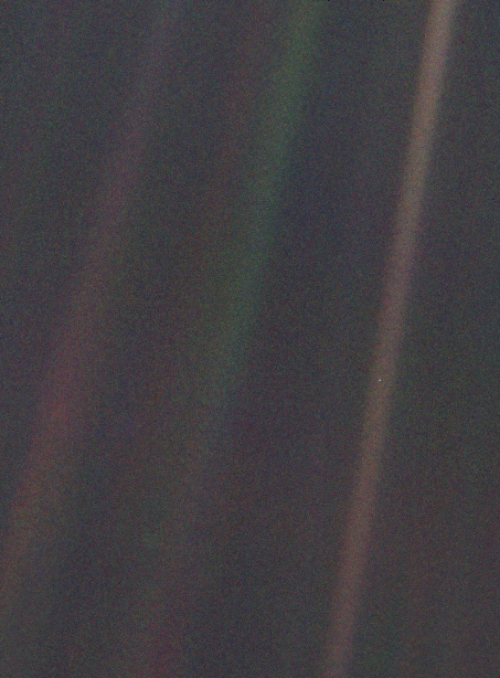 That's the pale blue dot by the way. Can you see it?
In fact, it turns out to be more interesting than you might think. To start with, we need a map of where is the land and where is the ocean. Luckily, these exist, and you can download them, for free, from NASA, and do this yourself.
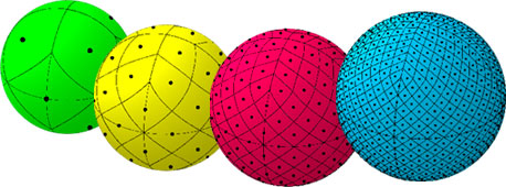
 The above picture is my version of the Earth from this data. How did I make this? Well, I had to deal with a tricky thing, namely, how to you draw equal-sized patches on a sphere? If you don't think this is an issue, look at a soccer ball - you can't cover a sphere with equal, regular shaped pieces.
But wait, there is a very neat solution, called healpix, which covers a sphere with little shapes. The cool point is that, while the little patches have slightly different shapes, they have the same area, making calculations of the density easy.
 There is a port of healpix into python, so it is easy to load the land map above and place it onto a sphere, with zeros for the ocean, and one for land.
Each of the dots in the picture represents the centre of the pixels, and so if I've got enough of those, I've got a pretty good coverage of the surface of the Earth.
What I do then is take a look above each of the pixel centres, and see how much land and how much sea I see. But firstly, there is something I have to take account of, namely this:
 Huh? Well, it's something familiar to fans of rugby. Basically, the posts are a fixed distance apart, but the angle they present depends upon the orientation of the posts relative to the kicker, something known as projected area, and we need to multiply by a cos(φ) term. We'll also assume that we are far enough away that we see one-half of the Earth around our point of interest.
OK, with all of this, we can ask what the distribution of views gives us. Remember, roughly 71% of the Earth's surface is covered in water. This is the distribution we get
 This is very cool! This is the proportion of our view which is land (taking into account the geometrical effects I noted above). It ranges between ~0.1 and 0.5, so clearly, there is no view of the Earth which is 100% water, and the best we can do is roughly 50% of an image containing land.
So, where are the most and least watery views. The minimum, with 8.3% of the image being land is, as you thought, above the South Pacific, at a (lat,long) = (-15.1,-165.4). Here's the view from Google Earth; pretty watery!

 Excellent!
But another question hit me. Remember, what we are looking at here is what fraction of the image is water and what fraction is blue and which is green (roughly). But the question I had was "In which views do you seem the most land area, and in which the least?" This means taking out the projection effect, so land and water near the edge will contribute strongly to the total amount of actual proportions of each in our image.
Cutting to the chase, here's the most water, from a (lat,long) = (-40.2,-177.9);
 As expected, lots of water around the edge, and, in fact, we are only seeing 15% of the land of the Earth, making up 10% of the surface we can see! And the opposite, with the minimal amount of water?
 This is above (lat,long) = (40.2,2.1), above the Balearic Sea, although it is nice to see Blighty so prominently placed. As expected, a lot of land is visible around the edge, and we can see all of the continents except for Australia and Antarctica, and land makes up 45% of the surface of the Earth we can see.
Finally, a little home work. I was initially surprised when I looked at the distribution of views we get in this case. It looks like this;
 Clearly, it is symmetric, and I thought that this must be wrong. But a little thought and a few tests, it was clear that it is correct. But why? I'll give you a clue, it is symmetric about ~0.29.
Answers on a postcard....
I'm a fan of learning things through problems. Specifically, in this example, I wanted to shuffle off my dinosaur image with regards to programming, and learn more python, which is the language of choice of the younger generation (although why people think that an interpretative language is better than a "deeper" programming language, I don't know - grumble, grumble, grumble....).
Right, to the problem in hand. The Pale Blue Dot is our planet Earth, our home. We know that it is a Water-World, but luckily not the Waterworld, but a planet whose surface area is 70% water. We're plodding along on a minority of the planet.
So, I woke up on Sunday and thought - "What is the view of the Earth that shows the maximum amount of ocean?" and conversely "What is the view of the Earth that shows the most land?". Yeah, I know, but my head chugs through things like this on a Sunday morning.
So, the question I have, to be answered with python, where do I stand on the Earth, such that, if I fly vertically upwards and look back, I get a particular view, either the most ocean or the most land in our view.
I gave this a minutes thought before I started, and I came to the conclusions which I am sure you did. To see the most ocean, surely we should start somewhere over the Pacific, probably the Southern Pacific. For a view of land, then Russia is your target. Starting somewhere in Russia and heading upwards will give you a view of lots of land.
But can we confirm this?
In fact, it turns out to be more interesting than you might think. To start with, we need a map of where is the land and where is the ocean. Luckily, these exist, and you can download them, for free, from NASA, and do this yourself.

But wait, there is a very neat solution, called healpix, which covers a sphere with little shapes. The cool point is that, while the little patches have slightly different shapes, they have the same area, making calculations of the density easy.
Each of the dots in the picture represents the centre of the pixels, and so if I've got enough of those, I've got a pretty good coverage of the surface of the Earth.
What I do then is take a look above each of the pixel centres, and see how much land and how much sea I see. But firstly, there is something I have to take account of, namely this:
OK, with all of this, we can ask what the distribution of views gives us. Remember, roughly 71% of the Earth's surface is covered in water. This is the distribution we get

So, where are the most and least watery views. The minimum, with 8.3% of the image being land is, as you thought, above the South Pacific, at a (lat,long) = (-15.1,-165.4). Here's the view from Google Earth; pretty watery!

And the opposite, the most land based image? It is still 49% water, but here it is, above (lat,long) = (52.8,42.3), and as you quite smartly guessed, it's in Russia :)

But another question hit me. Remember, what we are looking at here is what fraction of the image is water and what fraction is blue and which is green (roughly). But the question I had was "In which views do you seem the most land area, and in which the least?" This means taking out the projection effect, so land and water near the edge will contribute strongly to the total amount of actual proportions of each in our image.
Cutting to the chase, here's the most water, from a (lat,long) = (-40.2,-177.9);


Finally, a little home work. I was initially surprised when I looked at the distribution of views we get in this case. It looks like this;


"... but how blue?"
ReplyDeleteI don't know about how blue, but certainly none more black.